Tea Funny is the largest company to introduce Bubble Tea drink in the Russian market. This drink was invented and became very popular in 1980s on Taiwan Island. It consists of freshly brewed tea or milk, natural syrup and toppings: tapioca, juice balls, fruit jellies. Recently bubble tea has become popular in European countries as well, for instance in Great Britain and Germany.
Tea Funny Company came to the Russian market with a visual identity which had been developed in Taiwan but with the time the Company understood that their previous design was meant for very little children and didn’t meet the expectations of Russian target audience. Then the Client turned to our Bureau to have a new identity developed which would comply with the Company strategy and target audience. We discovered the key moments of the strategy and the creative brief on which our visual identity was built:
— Strange unusual combinations, minimalism,
— Product from Asia,
— Target audience – young people aged 16-24.
We analyzed the main visual identity for this product popular in the world and came to the conclusion that the most part of those solutions is meant for children aged 8-13 whereas Tea Funny’s target audience is 16-24 years old that is why our goal was to create the identity which would be close and understandable to modern young people in Russia.
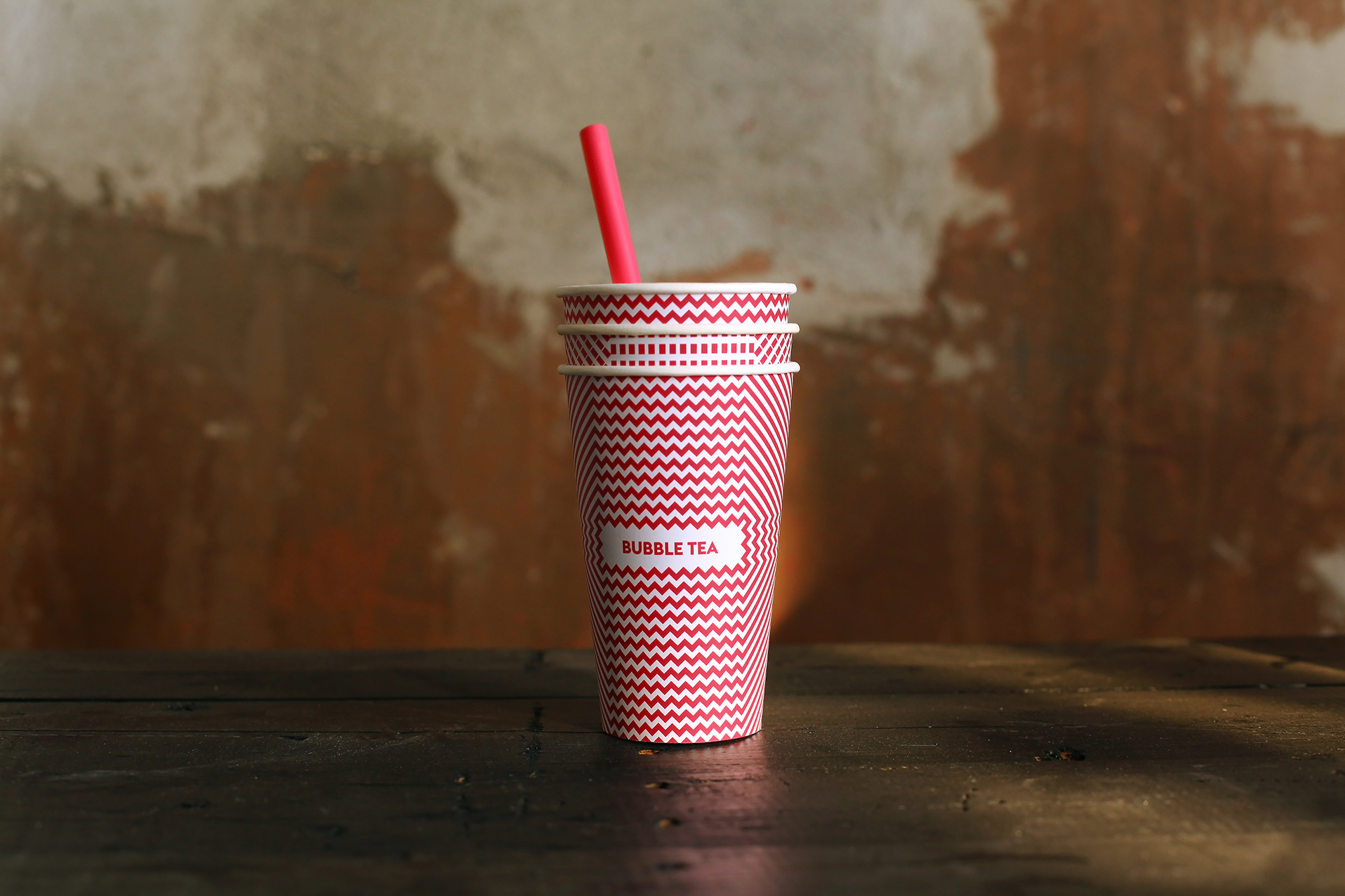
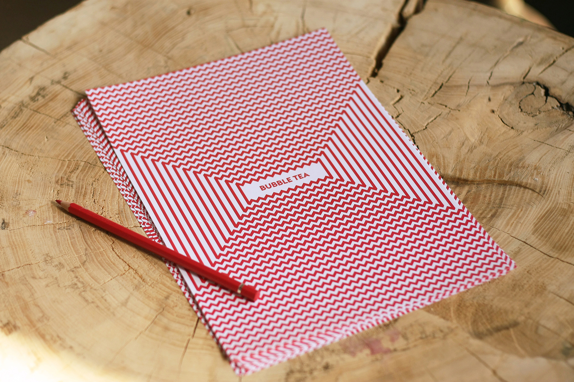
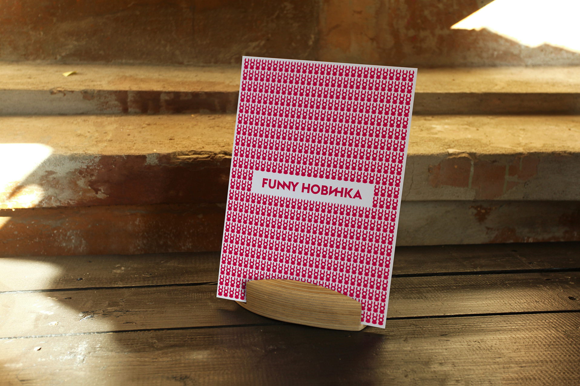
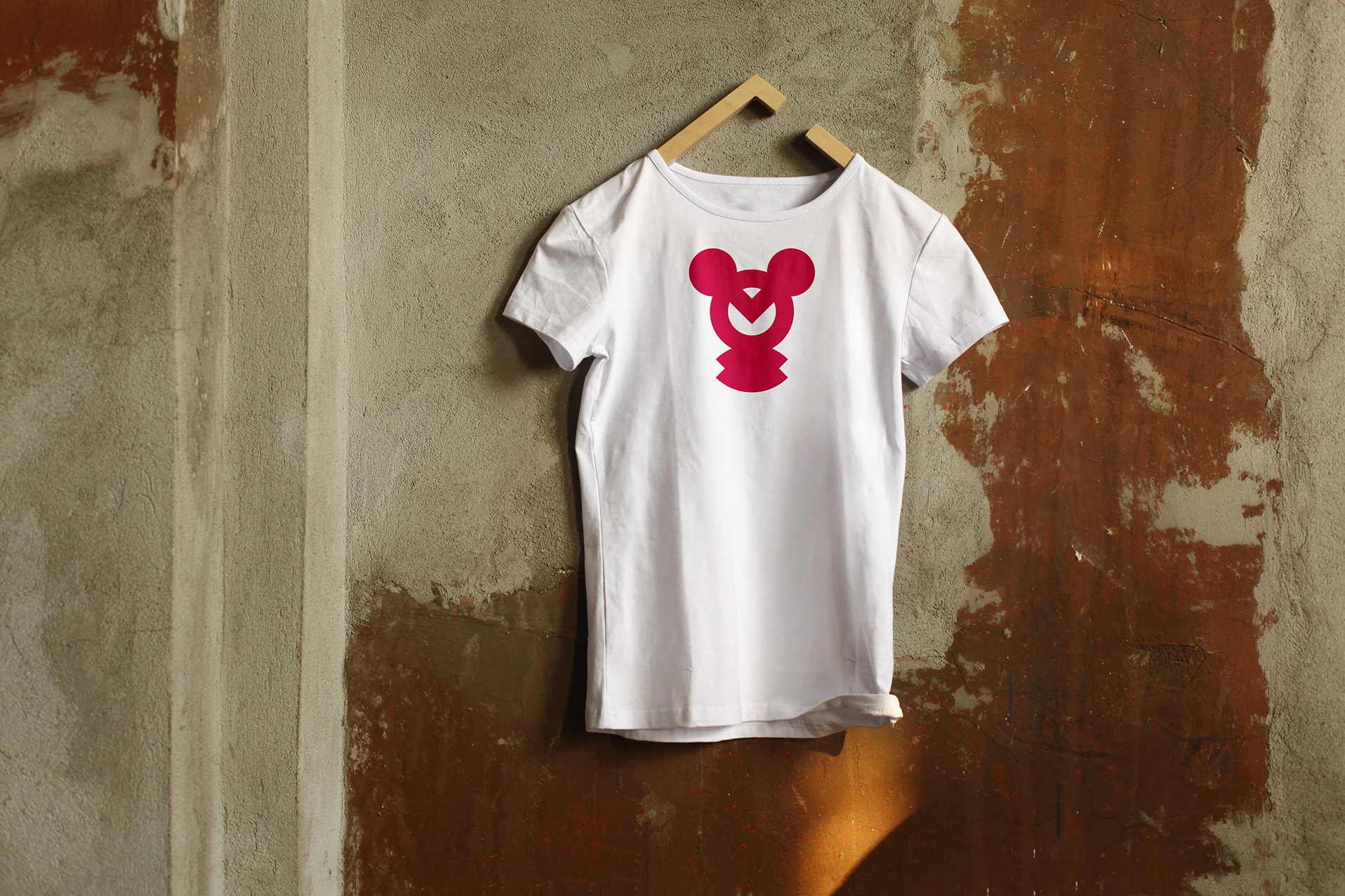
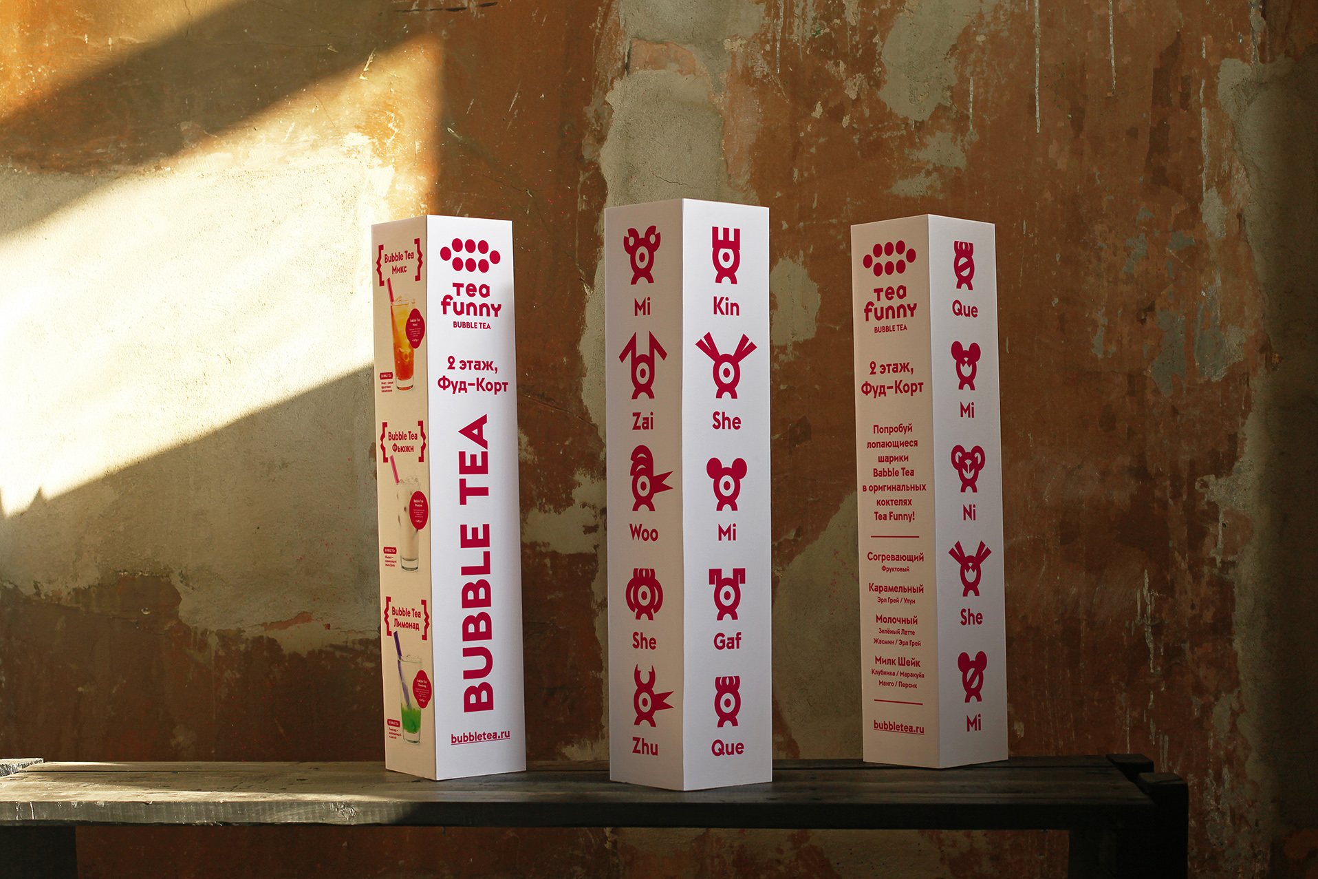
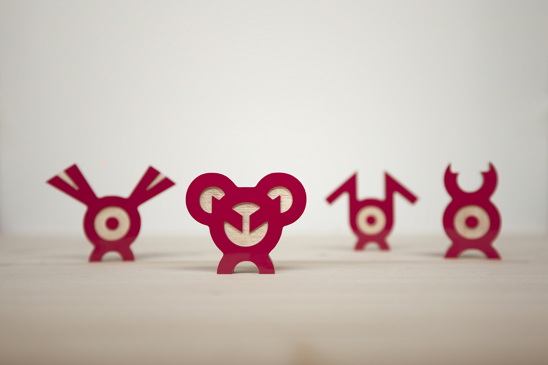
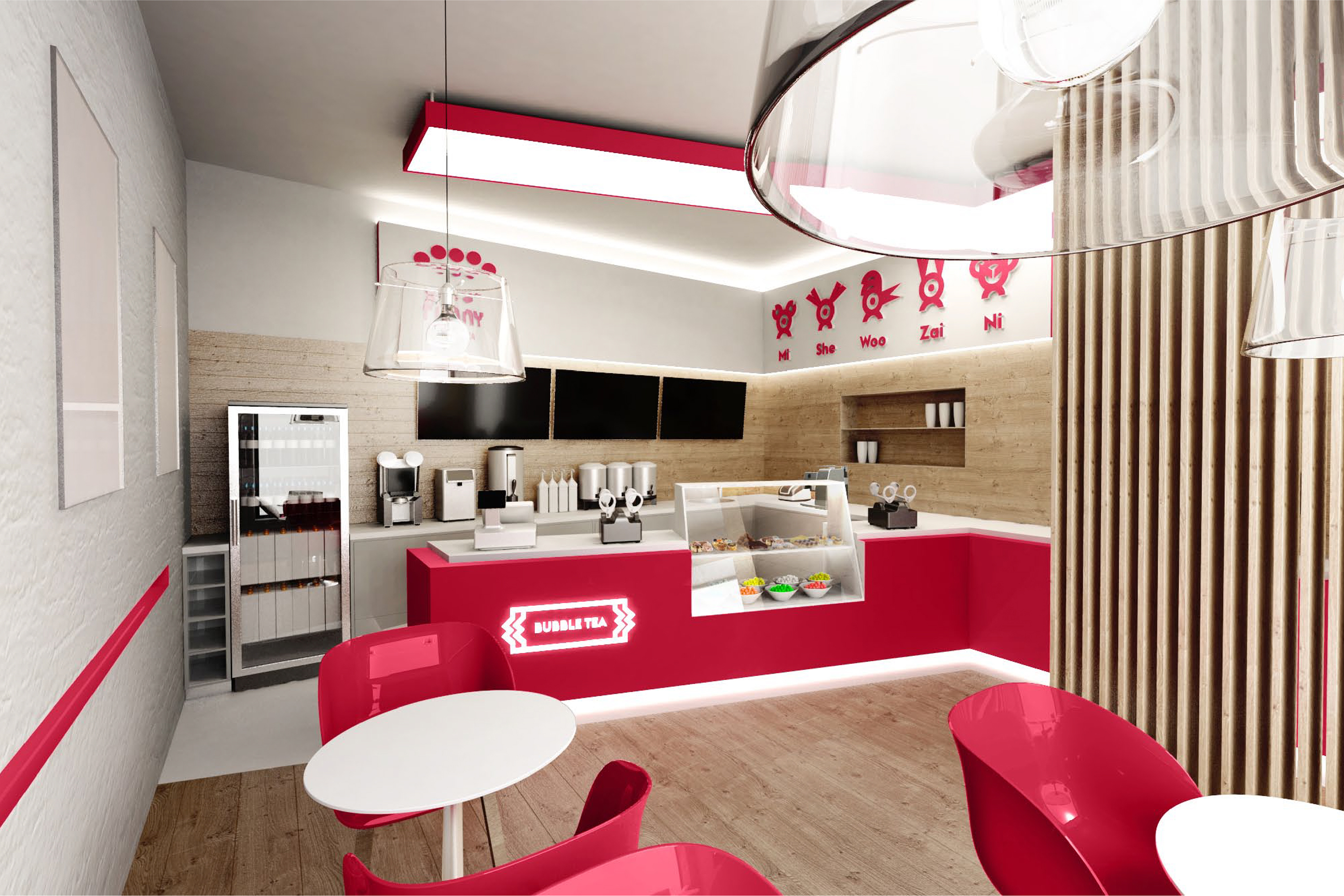
We have designed a laconic, simple but diverse style bringing all the palette to one colour – red (Tea Funny’s previous style was garish). Besides the new logo we have created a number of unusual characters indirectly associated with toppings and a lot of various drawings reflecting the big assortment of bubble tea cocktails. We made the ‘bubble tea’ descriptor the accident element which can be used independently of the logo. We have developed a custom Cyrillic version of Euclid BP and a slanted style particularly for this project, dubbed Euclid TF. To get more accidence we use ligatures which help show the unusualness of the drink in simple text messages. All the developed graphics and characters are made in two fonts: regular and slanted which allowed us to avoid the static menu and substitute it with the animated one as well as with different commercials which are shown on the displays in Tea Funny’s shops. Besides kiosks in trading centres Tea Funny opens street cafes for which in addition to our white-red colour palette we implement wooden textures emphasizing the naturalness of the product.
Project elements:
Awards:
Creative Director:
Designer:
Technical designer: